Reducing repeat contacts by 45%: providing context aware self service for 50M+ customers
Zalando SE is europe's largest online fashion platform. 51.8M active customers, 29 European markets, €10.6B revenue. Zalando's FAQ showed every customer the same static page, regardless of whether they had a delayed delivery, a pending return, or a missing refund.
I redesigned the experience to provide context by surfacing real-time delivery order-specific status and returns and refunds information; thus eliminating roughly 900,000 repeat contacts per year and saving €3.2M annually across European markets.
The cost of failed Self Service
Every customer who contacted Zalando support cost €3.50 across email, phone, and chat. With 2 million repeat contacts per year, that added up to €7 million annually in avoidable costs. Customer satisfaction sat at 3.1 out of 5, and the average resolution took 24 hours.
The root cause wasn't complicated. Zalando's FAQ was a static, one-size-fits-all page. A customer with a delayed delivery saw the same content as someone waiting on a refund. No awareness of their orders, their parcels, or their situation. So customers who couldn't find answers through self-service hopped to another channel: phone, email, chat. Those who'd been failed before skipped self-service entirely and went straight to an agent. The system had trained its own users to distrust it.
Five questions dominated support volume: Where's my refund? Where's my package? How do I return this? What's the latest status? Where do I drop this off? Every one pointed to the same problem. The help experience had zero awareness of what the customer actually needed.
50,000 transcripts revealed the real problem
I ran 12 user interviews across multiple European markets, 8 stakeholder interviews spanning product, engineering, and customer care leadership, and the team analyzed 50,000+ support transcripts for conversation patterns and failure points.
Delivery Flow: Providing context to users about the status of their delivery
Two findings drove the design direction.
Context over comprehensiveness
Customers don't read comprehensive help pages. They scan for the one piece of information relevant to their specific situation. Detailed FAQ content caused overload and abandonment. The initial assumption was that customers needed more information. Research proved they needed the right information at the right moment.
Recognition over recall
When managing multiple parcels, customers recognized products by their photos, not by order numbers. "ZAL-2024-8847291" means nothing when you have five active orders. Customers think in "the blue jacket" or "the running shoes," not system codes. That changed the identification layer of the design entirely.
Context beats comprehensiveness. Customers don't need more information, they need the right information at the right moment.
How the system works
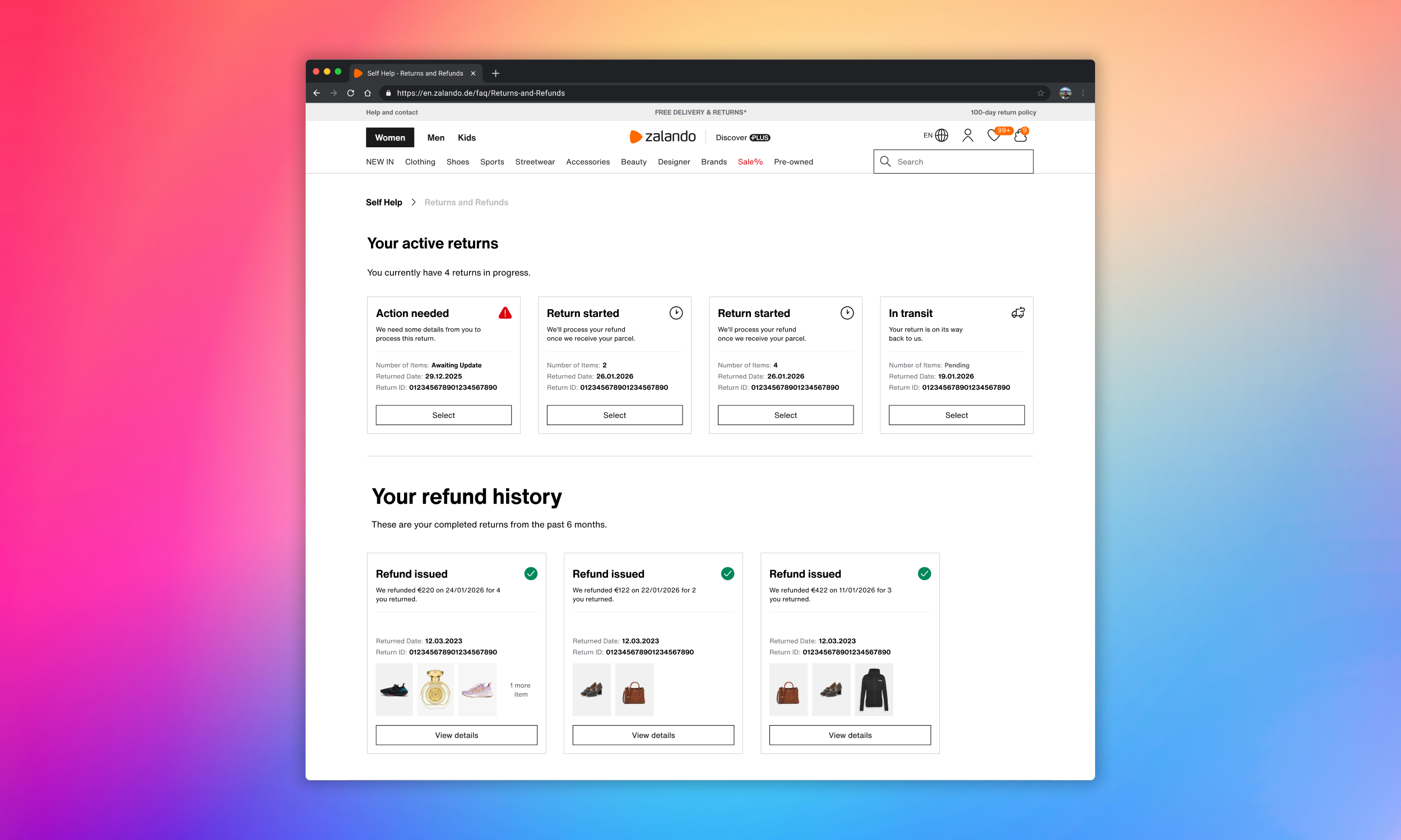
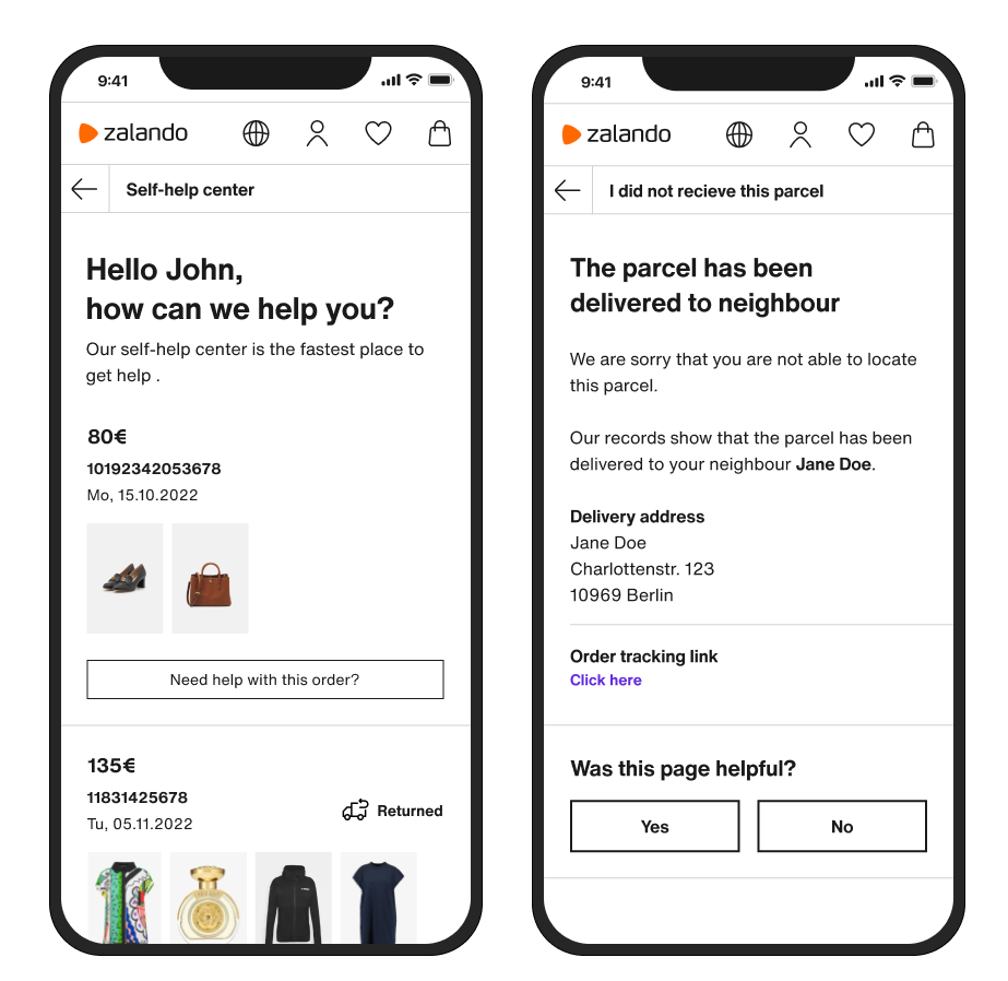
The solution identifies authenticated customers through API integration, pulling order and parcel data from their profile. Based on each parcel's journey stage, it surfaces relevant contextual information driven by real-time carrier, warehouse, and payment data. Every customer sees information specific to their situation rather than generic FAQ content.
The experience adapts based on how the customer arrives. Customers coming through Google search land on a specific FAQ section and see only cards related to that query. Customers arriving via website navigation or their account see all active cards. In both cases, product images ensure instant visual recognition across multiple orders.
Each journey type has its own tailored information architecture. Delivery uses progressive disclosure from a status glance to full details, with the option to report non-delivery. Returns show a staged vertical flow with confirmed data only (carrier pickup, in transit, warehouse scan, inspection). Refunds display horizontal cards with amount, timeline, and payment method, with escalation when amounts are delayed or incorrect.
When self-service can't resolve an issue, the customer creates a support ticket that carries the full context of their journey: what they searched for, which parcel they selected, what status they saw, and what resolution path they tried. Agents follow up with the entire case in hand. No repeating yourself.
Delivery shipped first, providing early learnings for subsequent phases. When I discovered the dashboard couldn't hold both delivery and return flows simultaneously due to API constraints, I pivoted: customers navigate from the delivery dashboard into returns and refunds as a connected journey. The pivot actually created a more intuitive flow, reflecting how customers experience these stages sequentially.
Three decisions shaped the direction
Before arriving at the final solution, I explored alternatives for each major design decision. Each choice was validated through research, not assumption.
Customers already had four established paths to the FAQ. A new destination would require learning new behavior. Embedding the solution where customers already went meant adoption happened naturally.
Jakob's LawUsability testing confirmed that detailed first-screens created the same overload problem the old FAQ had. Minimal cards with drill-down architecture let customers go only as deep as their problem required.
Progressive disclosure (NNGroup)Customers couldn't recall system-generated codes. They identified purchases visually. Product images became the primary identifier; order IDs were reserved for agent escalation.
Recognition over recall (Heuristic #6)8 out of 12 participants completed the primary task flow in the first usability round.
Two friction points emerged: unclear escalation entry points and confusion between return stages.
Card layout differentiation came from testing, not upfront design.
Returns needed vertical staged flows to show sequential progress.
Refunds used horizontal cards to display amount, timeline, and payment method simultaneously.
The transformation in numbers
increase in agent productivity: routine inquiries handled through self-service freed agents for complex interactions
increase in automation rate: intelligent routing reduced the volume reaching agent-assisted channels
Context beats content every time
The most important shift was moving from "comprehensive" to "contextual." Research proved customers didn't need more information. They needed the right information at the right moment.
That single distinction drove the 45% reduction in repeat contacts, the 28% CSAT improvement, and the €3.2M in savings.
Push for technical discovery earlier. The carrier API investigation happened mid-project. Starting it during discovery would've shaped early design decisions and reduced rework during the return flow pivot.
Broader usability testing reach. 12 participants in the first round was sufficient for direction, but a larger, more diverse sample across additional European markets would've caught regional friction points earlier.
Embedding solutions into existing user journeys consistently outperforms creating separate destinations. When you design where users already are, using the mental models they already have, adoption becomes a natural extension of existing behavior rather than a new behavior to learn.